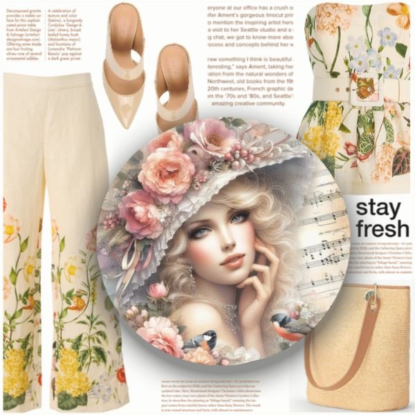
when i publish a set things move from where they are in the "create space". i wonder why this happens and what could fix it!? the sets i have created alien in the create space and i publish it and items move out of alignment. i go back and edit it and still in the publishing of the art it no longer lines up with the back round. so frustrating! lol! help!
-
-
@heartsongs Yes, it happens to all my sets, it is maddening and editing won´t help because when I fix one thing other two move instead or completely disappear from the picture. I don´t know why it´s happening, but I spend hours making sure everything is perfectly aligned, and when I post the set and see the result
-
I try to use "Full screen" on Google Chrome (marked button on the picture below), or I use FN + F11 on my Toshiba laptop (it's just F11, without FN, on some devices). This helps me have a better view of the work space


Maybe this could help, but I'm not sure, it's just a suggestion.
I didn't notice that any of my items moved from their original positions, so maybe it's the best to let the administrators ( [email protected] ) know about this.Good luck!

-
By the way, it's also good to pay attention to the space that an item takes up - some items seem small, but they take up a lot of space in the set (example on the picture below).
.

.
For example, this "DAILY LOOK" item cannot be placed in the bottom of the set because it takes up more space. However, this space around the item becomes smaller when the item is cropped.This frame that I use for my sets might also be helpful when trying to set up borders of the work space: https://urstyle.com/shop/9697290
It's quite minimal and you are free to use it if you want!

-
@vn1ta Hi dear, that´s not the issue we (or I) are talking about. I know things and corners should not be out of frame (thank God for cropping), you can see it on this set:
- the pink banners on top are not aligned (they were when I posted them)
- the lower left corner shadow under the big picture jumped down little (it was OK before posting)
- the first picture on the right is missing right corner shadow (it was there before posting)
- in the middle picture, the upper right shadow isn´t aligned (it was before posting) and the lower shadow is not very visible (it shifted little to the left)
- the bottom picture is missing both corner shadows (they were there before posting) and for some reason, the straight under shadow jumped on top of that picture
These are small things but it makes the picture looks sloppy and unfinished. And this was after 2 editing, I rectified one thing, something else moved. I spend a lot of time making sure everything is where it´s supposed to be so I just don´t understand.
And that´s when I´m lucky, right now I´m waiting for the publishing of my latest set, it´s still "loading" - for more than two hours!

-
@petri5 Oh, I see! I didn't notice it because the set is truly beautiful (not trying to flatter
 ) . In any case, I understand why it bothers you.
Admin made this topic for our suggestions, so you could post there if you want - there are more chances that they'll see the problem - maybe there is a simple solution and they can solve it quickly:
https://urstyle.com/topic/447258/new-featuresGood luck, dear!

-
@vn1ta I'm the same way .... -)
-
@vn1ta thank you for your very kind reply!
-
@heartsongs You're most welcome, dear!


